UX Improvement: View aggregate API usage metrics by time period
In the Sensible app’s Dashboard, you can now view aggregate usage metrics for your selected time period when you hover on a day, in addition to viewing that day’s metrics: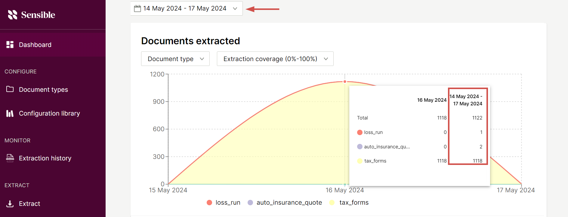
Improvement: Advanced configurability for Intersection method
For the Intersection method, you can now relax the criteria by which Sensible determines that a region at the intersection point “contains” lines. For example, use the new Percent Overlap X and Percent Overlap Y parameters to extract lines with variable alignment: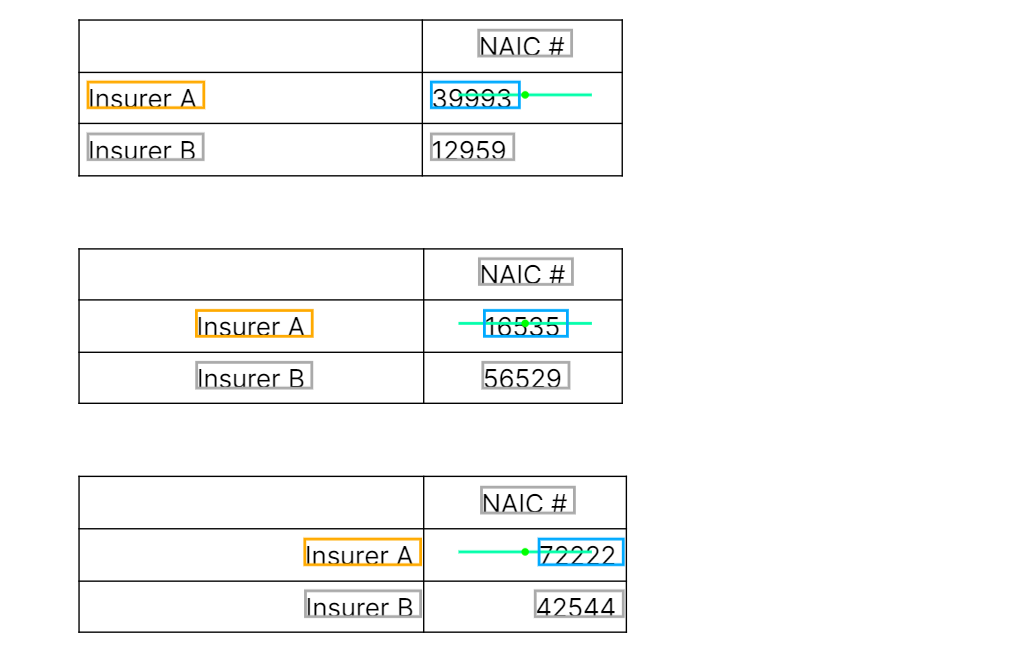 For an example, see the Intersection method.